Search This Blog

Showing posts with label open source BI. Show all posts

Wednesday, February 27, 2013

Customizing bullet graph in Ctools on Pentaho BI Server Community Edition - Part II - Conditional Formatting

In my previous post, we had seen how to customize some aspects of the bullet graph including the colours of the range values and the bar (measure value) and the target value (marker). In this post, we will carry on from there and add conditional formatting based on the data (red or blue).


One of the principles of Information Design is to use colour to attract attention to something that needs attention. All the other colours need to be blended so as to not attract attention. I would like to add the capability that the colour of the bar (measure value) changes based on which range the value falls in.

Conditional Formatting of a Bullet Graph

Lets start, from the place we left off. Since we have already customized our chart quite a bit, let us duplicate that and start from there.
To duplicate, navigate to the component you are interested in, highlight it and click on the icon to duplicate component as shown below.


I have modified the following values.


Parameter Value Description
Name chtInnovation Name of the component instance
Bullet Measures 69 The observed measure for this performance indicator
Title Innovation/ Technology Investment A title for all the graphs. In case, the graph is created for multiple categories, one bullet title appears for all the bullet graphs. Usually appears on top of the graph.
HtmlObject Panel_3 Name of the placeholder for the graph. Clicking on backspace in the text input box, displays the list of available html containers.

These changes are shown below.


Clicking on preview, we can see the following dashboard.


To apply conditional formatting, we need to change in Advanced Properties. Make the following changes in Advanced Properties. Click on values for Extension points


Add the following entry as an additional argument


Argument Value Description
bulletMeasure_fillStyle function(v,d){var accVar=50;if(d.ranges && d.ranges.length>2){accVar=d.ranges[d.ranges.length-2];} if(v>accVar){return "#43578A";}else{return "#CE2B0F";}} Adds conditional formatting to the measure bar, that if there are ranges defined in the bullet graph and there are atleast 2 of them, then highlight the fill colour if the measure is less than second last range.

In the code above, since our measure value is 69, and the top but one range starts from 75, our graph should appear in a shade of red rather than the default colour, which is a shade of blue.
Upon adding, the new argument will look as following on the Extension points form.


Now saving the graph and previewing it, we can see the bullet graph colour change when value is less than second range (75), which means it is a cause for concern, as shown in the screen below.


In this post, we saw how to add conditional formatting to bullet graphs so that is there is something that needs to be brought to the attention of a busy executive, it can be highlighted appropriately based on relative value of the measure to the ranges.

Wednesday, February 20, 2013

Customizing the bullet graph in Ctools on Pentaho BI Server Community Edition

Continuing on my posts on Executive dashboards and Open source BI platform (specifically Pentaho), I would like to start with perhaps the most important graph component to start off an executive dashboard in my opinion - bullet graph. Conceived by Stephen Few in now a famous specification, bullet graphs get to the point without unnecessary frills.

In my previous post, we had started building a BI dashboard using a 3 column layout using the Pentaho BI Server. Luckily, out of the box bullet graphs in Pentaho community edition are already very compelling. In this post, we will customize the Bullet graph to match the ideal look and feel that I wanted for the dashboard utilizing customizations that are not that widely known.

Here is what I want my final bullet graph to look like.


We will start with the steps to create a simple bullet graph, followed by the steps to customizing it.

Creating the simple bullet graph

Adding a bullet graph in Pentaho BI Server community edition is a simple task. First in the Layout view, identify a column where we will drop our chart. To add a simple bullet graph, switch to the components tab, navigate to the charts section on the left and click on CCC Bullet Chart link.


Clicking on the link will add a new chart component to our configuration. We can enter some details as follows.

Parameter Value Description
Name SimpleBulletGraph Name of the component instance
Width 300 Width in pixels
Height 100 Height in pixels
Bullet Title “” Title of the bullet graph. In case, the graph is created for multiple categories, one bullet title appears for each bullet graph.
Bullet subtitle “” Subtitle of the bullet graph
Bullet Measures 90 The observed measure for this performance indicator
Bullet Markers 95 A marker, such as a target value for this performance indicator
Bullet Ranges [25,50,75,100] A coloured range showing ranges of poor, acceptable, good and excellent values or similar to help the audience interpret the data.
Title Simple Bullet Graph A title for all the graphs. In case, the graph is created for multiple categories, one bullet title appears for all the bullet graphs. Usually appears on top of the graph.
HtmlObject Panel_1 Name of the placeholder for the graph. Clicking on backspace in the text input box, displays the list of available html containers.


Clicking on preview, we can see how the out of the box bullet graph looks like.


Customizing the bullet graph

We needed to customize the bullet graph to make it match the overall site as well as apply some information architecture principles.

These include the following changes
  1. Modifying range colors
  2. Modifying the marker symbol (target value)
  3. Modifying the bar color (measure symbol) based on value relative to scale
  4. Modifying scale look and feel
  5. Modifying look and feel of the measure value.

Modifying range colors and marker symbol

Lets add another bullet graph to the second panel and set the properties very similar to our first graph.


Parameter Value Description
Name chtQualityOfLife Name of the component instance
Width 300 Width in pixels
Height 100 Height in pixels
Bullet Title “” Title of the bullet graph. In case, the graph is created for multiple categories, one bullet title appears for each bullet graph.
Bullet subtitle “” Subtitle of the bullet graph
Bullet Measures 90 The observed measure for this performance indicator
Bullet Markers 95 A marker, such as a target value for this performance indicator
Bullet Ranges [25,50,75,100] A coloured range showing ranges of poor, acceptable, good and excellent values or similar to help the audience interpret the data.
Title Quality of Life A title for all the graphs. In case, the graph is created for multiple categories, one bullet title appears for all the bullet graphs. Usually appears on top of the graph.
HtmlObject Panel_2 Name of the placeholder for the graph. Clicking on backspace in the text input box, displays the list of available html containers.


Now lets click on Advanced Properties link for the chart configuration (note the position of the mouse cursor in screenshot below).


This is what the screen looks like.


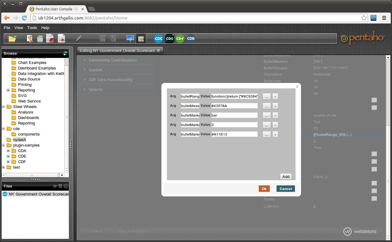
Click on the property Extension points, and add the following entries.

Parameter Value Description
bulletRange_fillStyle function(){return ["#9C9384","#DED2A0","#F2EED5","#FEFDF9"][this.index];} Changes the fill color for the ranges to a set of custom colors from the default grey. Note that number of elements in the array need to match the Bullet Ranges.
bulletMeasure_fillStyle #43578A Color of the bar
bulletMarker_shape Bar Shape of the Marker (Target) symbol
bulletMarker_lineWidth 3 Width of the Marker symbol
bulletMarker_strokeStyle #A11E13 Color of the line


Saving these settings and previewing the dashboard gives the following


Here is a close up of the updated bullet graph.


In the next post, we will see how to apply conditional formatting to the same bullet graph to make some values stand out.


Friday, December 14, 2012

Install Community Dashboard Tools on Pentaho BI Server 4.5 Community Edition

Soon after installing and setting up Pentaho Community Edition on my box, I realized that it does not ship with a dashboard tool. That has to be installed from another project called CTools.

Downloading CTools

CTools is available at http://www.webdetails.pt/index.html#ctools. Once you access this URL, you will access the following page.

The page contains a link to download Ctools bundle. Accessing that link shows the following page on the Github site.


We can download the shell script and the README.txt file to our local folder. I must warn that saving the ctools-installer directly from the browser and right clicking, actually gave me the html of the current page, rather than the file. For downloading the file, I had to click the file, go into edit mode and copy-paste the contents to a local shell script file.

Anyways, I downloaded it to a folder called ctools under my Pentaho folder. The first thing is to make ctools executable. This is done by entering the following command on the command line in a terminal window.

> chmod a+x *.sh


The next thing we need to do is to run the installer with the correct parameters. This is done, as shown below.

> ./ctools-installer.sh -s pentahoServer/biserver-ce/pentaho-solutions -w pentahoServer/biserver-ce/tomcat/webapps/pentaho

On my machine, the above works out to the following.

> ./ctools-installer.sh -s ~/Work/Servers/Pentaho/biserver-ce/pentaho-solutions -w ~/Work/Servers/Pentaho/biserver-ce/tomcat/webapps/pentaho


Executing the above script, we can see that the script downloads the necessary files needed for the installation. The script prompts to replace several of the existing scripts that I accepted, as show below.


Once the prompts are through, the installation starts and finally it is done!


Now we need to start the embedded tomcat instance contained within Pentaho dashboard, and we can see that upon logging in as a user, we can access additional links for Community Dashboards (called CDB, CDV, CDE and CDC).


Accessing link for CDE (Community Dashboard Editor), the user can now define their own dashboards as shown below.


That's it. We have successfully installed Community Dashboards on Pentaho Community Edition. In the next post, we will see how to configure a dashboard.

Download and Install Pentaho Community Edition Installation on Ubuntu 12.04

In this post, we are going to install Pentaho Community Edition on a Ubuntu 12.04 Edition. Pentaho is an open source Business Intelligence server. Business Intelligence or BI, as many of readers might know, is a set of technologies to allow executives and operators make sense of the data collected within an organization. It typically tries to collate data from different transactional and operational systems into a specialized data model such that data can be sliced and diced, and aggregated and analyzed through visual and other means to derive actionable intelligence for business decisions.

The details on the Community edition are available at http://community.pentaho.com/projects/bi_platform/


The first step is obviously going to be to access and install the BI server.We can access the Community Edition by accessing the following URL. At the time of writing this post, the latest version available was 4.5, which is available from the following location.

http://sourceforge.net/projects/pentaho/files/Business%20Intelligence%20Server/4.5.0-stable/


Downloading the BI Server

To download this 450 MB file, it took a long time as I was travelling at the time, and did not have access to a high speed connection. After a few unsuccessful attempts, I resorted to using Linux's wget command to download the file.


After many hours on the slow connection, finally the download was complete.


Installation Steps

To install the file, navigate to the location where the file was downloaded and unzip the file.


The BI Server includes an Embedded Tomcat instance. We can navigate to the folder in a command window and start the Tomcat instance by entering the following command.

Next step is to make the shell files executable by entering the following command.

> chmod a+x *.sh


Next step is to ensure that the embeddable Tomcat server is executable. For, doing that navigate to the bin directory of the embedded Tomcat server and entering the command to make the shell files executable.

> cd tomcat/bin
> chmod a+x *.sh


Last but not the least, we need to make sure that the embedded Tomcat instance can execute on the defauly port. For this we need to edit and change the Tomcat port, that is configured in the ./tomcat/conf/server.xml file. Since I already have one Tomcat instance configured on port 8080, I needed to change the embedded Tomcat port to 8082.


Change the port to 8082 in the appropriate connector entry. Also, we may need to change the shutdown port, which is 8005 by default, to something like 8007.


Finally, we can save the file and close it. Now, we can go back start Pentaho server by entering the following command.

> ./start-pentaho.sh


Now, we can access the Pentaho BI Server on the browser by entering the url http://ub1204.arthgallo.com:8082/pentaho


Now, we can login by entering the following credentials.

Administrator login: joe/password


Entering the password, we can see the following home page for Pentaho BI Server


That's it, we have Pentaho Community Edition installed. By the way, I soon learnt that the Community Edition Pentaho does not ship with a Dashboard, which was the purpose of the whole exercise. That is available through an extension, setting up which I have described in the a future post (http://opendesignarch.blogspot.com/2012/12/install-community-dashboard-tools-on.html).

All the best!