Search This Blog

Wednesday, February 27, 2013

Customizing bullet graph in Ctools on Pentaho BI Server Community Edition - Part II - Conditional Formatting

In my previous post, we had seen how to customize some aspects of the bullet graph including the colours of the range values and the bar (measure value) and the target value (marker). In this post, we will carry on from there and add conditional formatting based on the data (red or blue).


One of the principles of Information Design is to use colour to attract attention to something that needs attention. All the other colours need to be blended so as to not attract attention. I would like to add the capability that the colour of the bar (measure value) changes based on which range the value falls in.

Conditional Formatting of a Bullet Graph

Lets start, from the place we left off. Since we have already customized our chart quite a bit, let us duplicate that and start from there.
To duplicate, navigate to the component you are interested in, highlight it and click on the icon to duplicate component as shown below.


I have modified the following values.


Parameter Value Description
Name chtInnovation Name of the component instance
Bullet Measures 69 The observed measure for this performance indicator
Title Innovation/ Technology Investment A title for all the graphs. In case, the graph is created for multiple categories, one bullet title appears for all the bullet graphs. Usually appears on top of the graph.
HtmlObject Panel_3 Name of the placeholder for the graph. Clicking on backspace in the text input box, displays the list of available html containers.

These changes are shown below.


Clicking on preview, we can see the following dashboard.


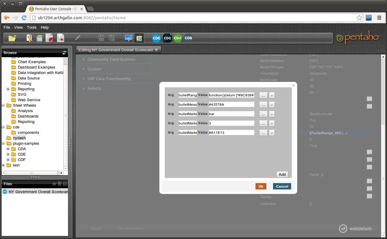
To apply conditional formatting, we need to change in Advanced Properties. Make the following changes in Advanced Properties. Click on values for Extension points


Add the following entry as an additional argument


Argument Value Description
bulletMeasure_fillStyle function(v,d){var accVar=50;if(d.ranges && d.ranges.length>2){accVar=d.ranges[d.ranges.length-2];} if(v>accVar){return "#43578A";}else{return "#CE2B0F";}} Adds conditional formatting to the measure bar, that if there are ranges defined in the bullet graph and there are atleast 2 of them, then highlight the fill colour if the measure is less than second last range.

In the code above, since our measure value is 69, and the top but one range starts from 75, our graph should appear in a shade of red rather than the default colour, which is a shade of blue.
Upon adding, the new argument will look as following on the Extension points form.


Now saving the graph and previewing it, we can see the bullet graph colour change when value is less than second range (75), which means it is a cause for concern, as shown in the screen below.


In this post, we saw how to add conditional formatting to bullet graphs so that is there is something that needs to be brought to the attention of a busy executive, it can be highlighted appropriately based on relative value of the measure to the ranges.

Wednesday, February 20, 2013

Customizing the bullet graph in Ctools on Pentaho BI Server Community Edition

Continuing on my posts on Executive dashboards and Open source BI platform (specifically Pentaho), I would like to start with perhaps the most important graph component to start off an executive dashboard in my opinion - bullet graph. Conceived by Stephen Few in now a famous specification, bullet graphs get to the point without unnecessary frills.

In my previous post, we had started building a BI dashboard using a 3 column layout using the Pentaho BI Server. Luckily, out of the box bullet graphs in Pentaho community edition are already very compelling. In this post, we will customize the Bullet graph to match the ideal look and feel that I wanted for the dashboard utilizing customizations that are not that widely known.

Here is what I want my final bullet graph to look like.


We will start with the steps to create a simple bullet graph, followed by the steps to customizing it.

Creating the simple bullet graph

Adding a bullet graph in Pentaho BI Server community edition is a simple task. First in the Layout view, identify a column where we will drop our chart. To add a simple bullet graph, switch to the components tab, navigate to the charts section on the left and click on CCC Bullet Chart link.


Clicking on the link will add a new chart component to our configuration. We can enter some details as follows.

Parameter Value Description
Name SimpleBulletGraph Name of the component instance
Width 300 Width in pixels
Height 100 Height in pixels
Bullet Title “” Title of the bullet graph. In case, the graph is created for multiple categories, one bullet title appears for each bullet graph.
Bullet subtitle “” Subtitle of the bullet graph
Bullet Measures 90 The observed measure for this performance indicator
Bullet Markers 95 A marker, such as a target value for this performance indicator
Bullet Ranges [25,50,75,100] A coloured range showing ranges of poor, acceptable, good and excellent values or similar to help the audience interpret the data.
Title Simple Bullet Graph A title for all the graphs. In case, the graph is created for multiple categories, one bullet title appears for all the bullet graphs. Usually appears on top of the graph.
HtmlObject Panel_1 Name of the placeholder for the graph. Clicking on backspace in the text input box, displays the list of available html containers.


Clicking on preview, we can see how the out of the box bullet graph looks like.


Customizing the bullet graph

We needed to customize the bullet graph to make it match the overall site as well as apply some information architecture principles.

These include the following changes
  1. Modifying range colors
  2. Modifying the marker symbol (target value)
  3. Modifying the bar color (measure symbol) based on value relative to scale
  4. Modifying scale look and feel
  5. Modifying look and feel of the measure value.

Modifying range colors and marker symbol

Lets add another bullet graph to the second panel and set the properties very similar to our first graph.


Parameter Value Description
Name chtQualityOfLife Name of the component instance
Width 300 Width in pixels
Height 100 Height in pixels
Bullet Title “” Title of the bullet graph. In case, the graph is created for multiple categories, one bullet title appears for each bullet graph.
Bullet subtitle “” Subtitle of the bullet graph
Bullet Measures 90 The observed measure for this performance indicator
Bullet Markers 95 A marker, such as a target value for this performance indicator
Bullet Ranges [25,50,75,100] A coloured range showing ranges of poor, acceptable, good and excellent values or similar to help the audience interpret the data.
Title Quality of Life A title for all the graphs. In case, the graph is created for multiple categories, one bullet title appears for all the bullet graphs. Usually appears on top of the graph.
HtmlObject Panel_2 Name of the placeholder for the graph. Clicking on backspace in the text input box, displays the list of available html containers.


Now lets click on Advanced Properties link for the chart configuration (note the position of the mouse cursor in screenshot below).


This is what the screen looks like.


Click on the property Extension points, and add the following entries.

Parameter Value Description
bulletRange_fillStyle function(){return ["#9C9384","#DED2A0","#F2EED5","#FEFDF9"][this.index];} Changes the fill color for the ranges to a set of custom colors from the default grey. Note that number of elements in the array need to match the Bullet Ranges.
bulletMeasure_fillStyle #43578A Color of the bar
bulletMarker_shape Bar Shape of the Marker (Target) symbol
bulletMarker_lineWidth 3 Width of the Marker symbol
bulletMarker_strokeStyle #A11E13 Color of the line


Saving these settings and previewing the dashboard gives the following


Here is a close up of the updated bullet graph.


In the next post, we will see how to apply conditional formatting to the same bullet graph to make some values stand out.


Saturday, February 16, 2013

Fixing the Java version on Ubuntu

If you are like me, you have multiple versions of java installed on your machine. There was an initial version that shipped with Ubuntu, followed by the Sun JDK and if you have other applications installed then additional versions as well.

I ran into a similar issue on my machine when I had the right version of Java compiler being referenced but the compiled application was not running as it was picking the wrong version of Java run time.


$ javac -version
javac 1.7.0_07

$ java -version
java version "1.6.0_27"

Here is the screenshot...


I was baffled and an initial attempt at adding JAVA_HOME to .bashrc did not produce the desired results.

Finally, I learnt the right way was to update using update-alternatives in Ubuntu

Typing the following command on the terminal window lists the current version as well as the alternatives.

$ sudo update-alternatives --config java


I selected the option 2, as I needed to execute the compiled classes using Sun JDK.

Checking the java -version confirmed that the correct java had been selected.


There we go.... nicely done!


Sunday, February 10, 2013

Creating a dashboard with Pentaho Community Edition

As the information sources for business executives is increasing, taking decisions is becoming harder. It is for this reason, Executive dashboards are becoming more and more important. Organizations of all shapes and sizes are trying to see how to create Executive dashboards that provide actionable insights to their executives. In the government space, this is even more complex, as many departments and organizations have overlapping mandates that may also be contradictory at times. Executive dashboards provide a way to organize information within the enterprise to focus on actionable information. Open source BI platforms such as Pentaho, offer a compelling option to organizations, who would like to test their ideas before investing thousands in main stream BI platforms.

In this post, we will start the process to create a BI dashboard using Pentaho tools for a multi-perspective multi-organization dashboard. This exercise will go through several steps that involve  multiple technologies. To start off, I will start with creating a customized dashboard look and feel that will house the different KPIs. This I will do in the current post.

Now, in a separate blog post (http://syntharch.blogspot.com/2013/01/quality-of-life-kpis-measuring-human.html), I have started listing Social KPIs and Measures that could be used for measuring a range of social development outcomes. We will build the dashboard using these social measures within the series.

Starting Pentaho BI Server

In previous posts, we discussed installing Pentaho BI Server Community Edition, as well as Community Dashboard Tools on top of it. Let us navigate to the place our Pentaho BI Server is installed and start the Tomcat instance that ships with it.

On my machine, it as follows

> cd Work/Servers/Pentaho/biserver-ce
> ./start-pentaho.sh


Now, once the Tomcat instance has started, we can access the browser to launch the application. For me the URL is http://ub1204.arthgallo.com:8082/pentaho


Logging in the instance with the default username and password, we are shown the familar screen containing the home page. Upon logging in, navigate to the browse panel on the left, right click and select option to create a new folder.


In my case, I am going to call the new folder nydash.


Once created, I want to add a new dashboard page.


Now that the page is created, click on the Save option on the dashboard page. I am going to call it nygov scorecard and save it under the nydash folder.


Now that the dashboard is created, we need to create the bullet graphs that we need. The state government may want to track itself along multiple dimensions, say operational, policy and strategic.

On the Layout section, select the option to Apply a template. We need to click the icon on the Layout Structure to achieve this as shown below.


On the dialog box that pops up, choose the 3 column template.


Clicking on Ok, will give you the following screen.


Clicking on Preview gives us the following display.


We can close the preview. First thing we need to do is to fix some of the UI elements.

For this navigate to the Layout section, and expand the first row and column. Navigate to the background colour property and change it to #003366. Also change corners to Simple.


Next navigate to the nested html element. Clicking on the html element shows the html in an editable colour. Make the following changes

Text: New York State Performance Dashboard
Color: FFEFFF


Save and preview the changes.

Next navigate to Row 3. It will have 3 columns, each of which we will modify as follows.

Color: #EAEAEA
Corner: Simple


Next we update the first column of the last footer row to change the text as follows in the html element.


We also change the settings for the column as follows.

Span Size: 12
Text Align: Left

For the next row, we change it to

Span Size: 10
Height: 40
Text Align: Right

We also update the html to replace the default text with an image from NY gov site.


Lets preview what our template looks like


At this point, we are ready to add some components. We will do this in the next post. In my next post, we will add a bullet graph to the dashboard and customize the look and feel.


Sunday, February 3, 2013

Fixing libjvm.so not found issue during PostGIS installation


As mentioned in my previous post, while recently installing PostGIS 2.x on my machine, I ran into some issues. The issue was only discovered when I tried to enable PostGIS extension on a recent database I had created. The compile, build and installation of PostGIS went smoothly with no errors reported.

However, on entering the following command

psql > create extension postgis;


I got the following error

ERROR: could not load library....libjvm.so: cannot open shared object file: No such file or directory

Well, initially that had me baffled. On searching the error, I read that if PostGIS is compiled with the raster option, it relies on the gdal library, which may be looking for the libjvm.so, which it may not be able to find. Executing the program gdalinfo confirmed this suspicion.

$ gdalinfo

gdalinfo: error while loading shared libraries: libjvm.so ....


So, I started looking for jvm on my machine. I found multiple instances of libjvm on my machine, including the one that I was interested in.

$ locate libjvm.so

found multiple libjvm.so library instances.


I decided to make the libjvm.so as part of jdk 1.7 on my machine as the one I wanted the postgis instances to look for.

For this, I went to the folder where libjvm.so was, and entered the following command.

$ sudo ldconfig


Now, to confirm if my issue was resolved, I entered the following command.

$ gdalinfo


Great, it ran the command and told me the parameter list to execute the command. This was clearly an improvement. Next, I logged into psql and tried to re-execute the original command to spatially enable the database.

psql> create extension postgis;


Success!! My issue was resolved.